Cách vẽ Các dạng biểu đồ đặc biệt

Liên hệ QC

ptm0412

Bad Excel Member
Thành viên BQT
Administrator
Tham gia
4/11/07
Bài viết
13,777
Được thích
36,273
Donate (Momo)
Donate
Giới tính
Nam
Nghề nghiệp
Consultant
Use an Arrow to Indicate Special Points.
DÙNG HÌNH MŨI TÊN MINH HỌA CÁC ĐIỂM ĐẶC BIỆT TRÊN ĐỒ THỊ.
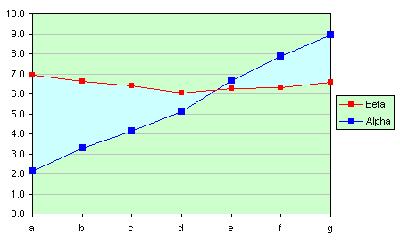
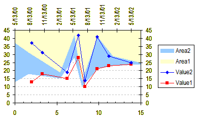
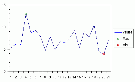
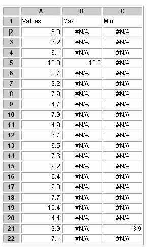
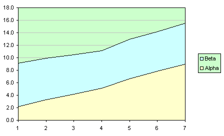
People often want to use an arrow or other symbol to indicate a point in a chart. If you draw an arrow, or any AutoShape, in a chart, it is not in any way tied to the data or to the chart axes, so it will not move to keep up with a point as the axes change or the chart resizes. Even if the chart does not change, an AutoShape is not guaranteed to be in exactly the same position the next time the file is opened. This technique shows how to attach an indicator (arrow) to a point by creating custom markers (see Custom Chart Series Markers) for the Min and Max series.
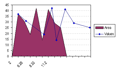
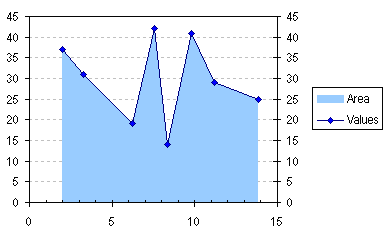
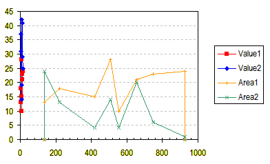
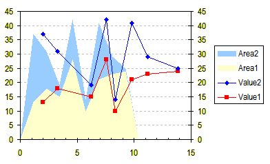
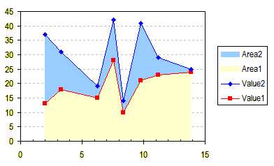
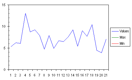
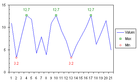
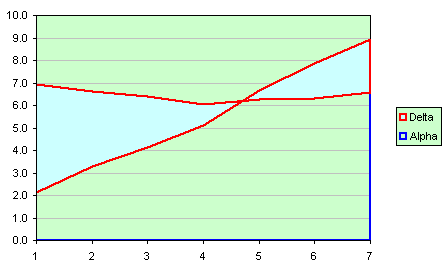
This example is based on the Special Format for Minimum and Maximum example. Start with the last chart in the Min/Max example, using small square markers, no lines, and no labels for the Min and Max series.
Người ta thường muốn sử dụng 1 hình mũi tên hoặc những biểu tượng khác để thể hiện trên 1 biểu đồ. nếu bạn vẽ 1 mũi tên hoặc 1 AutoShape bất kỳ lên biểu đồ, sẽ không có cách nào ràng buộc nó vào dữ liệu hoặc kết nối vào trục biểu đồ, nên nó sẽ không di chuyển khi các điểm trên trục thay đổi hoặc khi thay đổi kích thước biểu đồ. Ngay cả khi biểu đồ không thay đổi, khó mà bảo đảm rằng cái AutoShape nằm đúng vị trí khi mở file lên lần sau. Kỹ thuật sau đây cho thấy cách gắn 1 mũi tên vào 1 điểm trên biểu đồ bằng cách tạo những nút đánh dấu cho giá trị lớn nhất và nhỏ nhất của dữ liệu.
Thí dụ sau dựa vào sự thí dụ về định dạng giá trị lớn nhất và nhỏ nhất bài Special Format for Minimum and Maximum. Bắt đầu với biểu đồ cuối trong thí dụ nói trên, dùng nút đánh dấu, không đường kẻ khung, không nhãn cho các giá trị Min và Max.


Arrow01.gif


Pict 1​


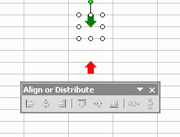
Make arrows of the size and format that you need, and circles of twice that size. The shapes will be aligned (and grouped) so that the point of the arrow will be in the center of the circle, and therefore centered on the point. In this example, the green and red arrows are one row tall, and the circle two rows in diameter.
Tạo các mũi tên với kích thước và định dạng bạn muốn, và các hình tròn có đường kính gấp đôi chiều cao mũi tên. Các mũi tên sẽ được canh và grouped với đường tròn sao cho điểm nhọn mũi tên chỉ ngay tâm đường tròn, nghĩa là ngay tâm của 1 điểm trên đồ thị. Trong thí dụ này, các mũi tên cao bằng chiều cao 1 dòng và đường tròn có đường kính bằng chiều cao 2 dòng.

Arrow02.gif


Pic 2​


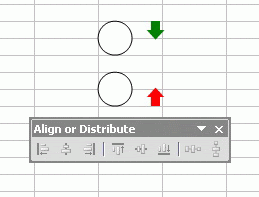
The floating command bar is the Align or Distribute tear-away menu from the Drawing toolbar. The first step is to select the shapes.
Toolbar Align or Distribute là 1 thanh công cụ con được gọi ra từ thanh công cụ Drawing. Bước đầu tiên là click chọn cả 4 hình.


Arrow03.gif


Pic 3​


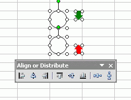
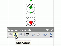
Align the shapes using the Align Center button on the menu.
Canh lại các hình với nút canh giữa.


Arrow04.gif


Pic 4​


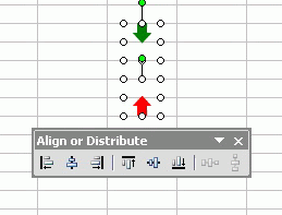
Select just the circles, and hide them by changing their formats to No Line and No Fill.
Chọn riêng các hình tròn và giấu nó đi bằng cách chọn định dạng không đường viền và không tô màu.


Arrow05.gif


Pic 5​


Select the green arrow and the corresponding circle, and group the shapes. Select the red arrow and its circle, and group them.
Chọn mũi tên xanh và hình tròn bao quanh nó, nhóm chúng lại. Làm tương tự với mũi tên đỏ và hình tròn tương ứng.


Arrow06.gif


Pic 6​


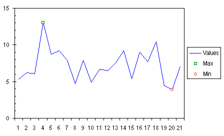
Copy the grouped shape with the green arrow, then select the Max series in the chart, and use Ctrl+V or Paste from the Edit menu, and the series will use the copied shape as the custom marker for the series.
Copy nhóm hình thứ nhất với mũi tên xanh, chọn điểm Max trên đồ thị, dùng Ctrl+V hoặc Edit – Paste để gắn nhóm này vào đúng chỗ, mũi tên sẽ trở thành nút đánh dấu tự chọn cho giá trị Max.


Arrow07.gif


Pic 7​


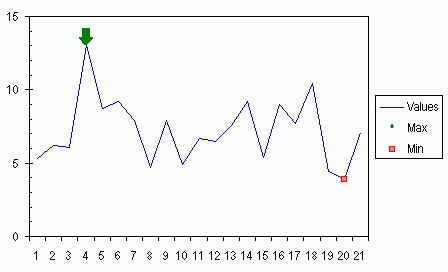
Note: If you select a series before pasting the shape, the entire series takes on the shape as its markers. If you select just a point, only that point will use the shape.
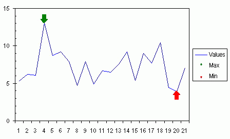
Copy the grouped shape with the red arrow, then select the Min series in the chart, and paste, to apply the copied shape to the series.
Nếu bạn chọn 1 đường biểu diễn (series) trước khi paste, nguyên đường sẽ lấy mũi tên làm nút đánh dấu. nếu bạn chỉ chọn 1 điểm của đồ thị, chỉ điểm đó xài mũi tên.
Làm tương tự với mũi tên đỏ cho điểm Min trên đồ thị.


Arrow08.gif


Pic 8​


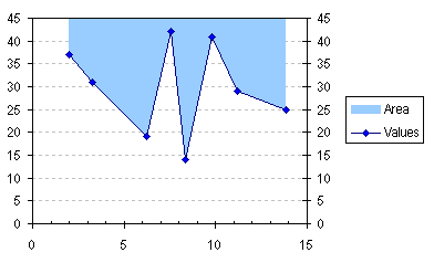
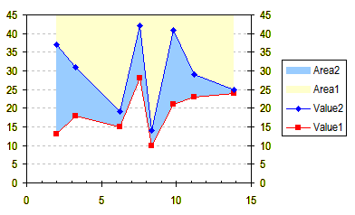
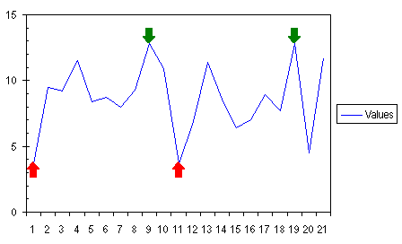
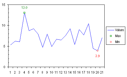
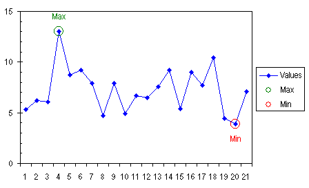
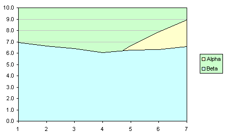
The purpose of the circle is further illustrated in the chart below. The circle used to make the custom markers now has a faint outline, so you can see how each entire marker is centered on its point, even though the arrows are offset.
Mục đích của đường tròn được minh họa như hình sau: Đường tròn nay có đường viền nhạt, để bạn có thể thấy tâm mỗi nút đánh dấu (nguyên nhóm tròn + mũi tên) nằm ngay vào điểm cần thiết trên đồ thị, mặc dù hình mũi tên thì lại có vẻ nằm trên.


Arrow09.gif


Pic 9​


The arrows are ineffective as legend keys, because the arrow/circle shape is shrunk to fit in the space of the original marker. Remove each legend entry from the legend by clicking once to select the legend, then clicking again to select the individual legend entry, and pressing Delete (click to select the text label, not the marker, or you will delete the entire series).
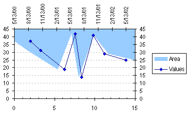
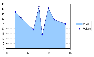
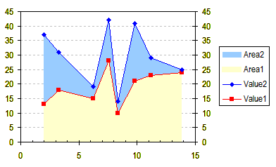
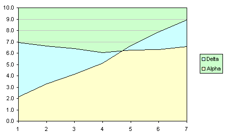
As with the data labels in the earlier example, if the data changes, the markers still highlight the maximum and minimum points.
Hình mũi tên không thể hiện rõ trên phần legend key, vì legend key thể hiện nguyên nhóm đường tròn + mũi tên. bạn có thể xoá từng cái bằng cách click lên nó 2 lần, 1 lần chọn nguyên bộ legenkey, 1 lần chọn riêng hình nút đánh dấu, sau đó nhấn delete. (nhấn lên dòng chữ chứ đừng nhấn vào cái nút, nó sẽ xoá nguyên đồ thị. Với dịnh dạng nhãn số liệu như thí dụ trước, khi dữ liệu thay đổi, nút đánh dấu lúc nào cũng hiển thị giá trị lớn nhất hoặc nhỏ nhất.


Arrow10.gif


Pic 10​
 
Special Format for Minimum and Maximum.

Special Format for Minimum and Maximum.
Định dạng cho các diểm Max và Min của biểu đồ.

Ever want to apply special formatting to just a certain point? This example shows you how to highlight the minimum and maximum values of a series by using a different marker for each, and data labels. We'll accomplish this with two extra series in the chart, one for minimum and one for maximum.
The Data
The example uses a simple data set, a series of values in A2:A22, formulas to indicate the maximum and minimum values in B2:C22, and headers in A1:C1. The formula in B2 is:
=IF($A2=MAX($A$2:$A$22),$A2,NA())
and the formula in C2 is:
=IF($A2=MIN($A$2:$A$22),$A2,NA())
Enter the formulas in B2:C2, select the range B2:C22, and press Ctrl-D to fill them down into the entire selected range.

Bạn muốn gán định dạng đặc biệt cho 1 vài điểm trên biểu đồ? Thí dụ sau đây chỉ cho bạn cách đánh dấu những điểm biểu diễn cho các giá trị lớn nhất và nhỏ nhất bằng cách tạo sự đánh dấu khác kiểu cho chúng. Chúng tathực hiện điều này bằng cách thêm vào 2 cột phụ: 1 cho giá trị nhỏ nhất và 1 cho giá trị lớn nhất.

Dữ liệu thế nào?
Thí dụ này sử dụng 1 dãy các giá trị đơn giản trong vùng A2:A22, Công thức tính cho các dữ liệu phụ nàm trong vùng B2:C22, tiêu đề là vùng A1:C1. Công thức của ô B2 là:
=IF($A2=MAX($A$2:$A$22),$A2,NA())
Và của ô C2 là:
=IF($A2=MIN($A$2:$A$22),$A2,NA())
Gõ 2 công thức này cho B2 và C2, chọn cả vùng B2:C22 và nhấn Ctrl+D để fill công thức xuống.

Pic01.gif

Pic01

Columns B and C contain #N/A error values except for the maximum and minimum values from column A, thanks to the clever formulas used in the range. Excel will only chart the numerical values, not the error values. If we had used "" to fill the range instead of NA(), we would get apparently blank cells, which the chart would treat as zeros, and plot along the horizontal axis.

Constructing and Formatting the Chart
Select the three columns of data, including the top row with headers, and construct a line chart, with lines and no markers. The chart has three series, but Min and Max don't appear, because there is only one point in each, and a line is the shortest distance between TWO points.

Cột B và C chứa những giá trị lỗi #N/A trừ 2 giá trị Min và Max, thật tuyệt khi có hàm NA() để dùng. Excel sẽ chỉ lên biểu đồ những giá trị số, không cho lên những giá trị lỗi. Nếu bạn thay các giá trị lỗi bằng “” với các cách bẫy lỗi ISNA(), ISERROR(), … chúng ta sẽ có những ô trống, và Excel sẽ xem chúng có giá trị zero, thế là Excel đánh dấu búa xua lên trục hoành ở những giá trị zero.

Thiết lập biểu đồ và định dạng:
Chọn cả 3 cột dữ liệu kể cả dòng tiêu đề, tạo 1 biểu đồ dạng đường kẻ, loại đường không có đánh dấu (marker). Biểu đồ sẽ có 3 series giá trị, nhưng Min và Max sẽ không nhìn thấy, vì mỗi serie chỉ có 1 giá trị, và đường thẳng thu về 1 điểm.

Pic02.gif


Pic02


Click on the legend, then click on the legend key for the Max series (the short green line segment). Press F1 to bring up the Format Series dialog. On the Patterns tab, select an appropriate marker (if you want to show a marker), and set the line to None. Repeat this with the Min series.

CLick chọn cái legend (Chú thích biểu đồ) và chọn cái legend của Max series (cái đường kẻ ngắn màu xanh). Nhấn F1 để vào hộp thoại định dạng Series. Trong tab Pattern, chọn 1 kiểu đánh dấu và chọn line là None. Làm tương tự với Series Min.

Pic03.gif


Pic 03


Double click the Max series, and on the Data Labels tab, select Show Values, and press Enter. Double click on the label, and on the Alignment tab, select Above for Label Position. On the Font tab, apply any desired formatting to the label's font. Repeat for the Min series, except select Below for Label Position on the Alignment tab.

Double-click cái Max series, trong tab Data Label của hộp thoại hiện ra, chọn Show Values, nhấn Enter. Double-click cái label, và trong tab Alignment, chọn Above cho Label Position. CHọn font trong tab fonts. Thực hiện giống vậy cho series Min, nhưng chọn Position cho label là Below.

Pic04.gif


Pic04


These custom labels and markers adjust when the data changes, and if there are multiple points that have the same Max and Min values, each point will share the custom formatting.

Cái nhãn tự chọn và cái nút đánh dấu sẽ tự dịch chuyển khi dữ liệu thay đổi. Và nếu có nhiều hơn 1 giá trị Max hoặc Min trong dữ liệu, nỗi điển tương ứng trên đồ thị sẽ có cùng định dạng.

Pic05.gif


Pic05


An alternative symbol (a large unfilled circle) and label indicates extreme points by encircling them.

Một ký hiệu khác, (1 hình tròn không tô màu) và nhãn cho những điểm cần nhấn mạnh, có thể dùng để bao tròn xung quanh nó.

Pic06.gif


Pic06


A variation on this technique uses custom markers to point an arrow at the extreme points.

Một cách khác của kỹ năng này ( Use an Arrow to Indicate Special Points) dùng 1 hình mũi tên ở các điểm này.
 
Apply Fill Color Between Lines in a Chart (Tô màu giữa 2 line trong 1 biểu đồ)

Apply Fill Color Between Lines in a Chart
Tô màu giữa 2 đường biểu diễn trong 1 biểu đồ.
(by Jon Peltier, MVP)

Introduction
One of the most commonly used chart types is the line chart. People often ask, "How can I fill the region between two lines with a particular color?" This article describes how to create a line chart with a shaded region between the lines.
Simple Line Chart
The table below shows an optimized data range for producing a chart. The data range does not need to start in cell A1, of course, but I've done that here for convenience. The top row of the data range contains series names, the left column of the data range contains categories (X values), and the other columns of the data range contain values (Y values) for each series. The top left cell of the data range is blank, which helps Excel determine whether to use the top row and column for series names and categories in cases of ambiguous data.
The chart is created by selecting one cell within the data range, or the entire data range, and starting the chart wizard. Start the chart wizard by selecting Chart from the Insert menu, or by clicking the Chart Wizard button, which has an icon like a small column chart, on Excel's Standard command bar.

Giới thiệu:
Một trong những dạng biểu đồ hay được dùng nhất là dạng đường kẻ. Người ta thường hỏi: Làm sao tôi có thể tô màu vùng nằm giữa 2 đường biểu diễn trên đồ thị? Bài viết này sẽ mô tả phương pháp tạo 1 đồ thị dạng line với vùng giữa các line được tô màu.
Biểu đồ dạng line đơn giản:
Bảng dưới đây cho 1 vùng dữ liệu mẫu để kiến tạo 1 biểu đồ. Vùng dữ liệu không nhất thiết phải bắt đầu từ ô A1, nhưng tôi vẫn làm thế cho thuận tiện. Dòng trên cùng là dòng chứa tên serie dữ liệu, cột ngoài cùng bên trái là vùng chứa các giá trị trục hoành (trục X)., và các cột khác chứa các giá trị Y cho mỗi serie.Ô trên cùng bên trái là ô trống nhằm giúp Excel xác định dòng đầu cho tên series và cột trái nơi chứa các giá trị X trong trường hợp có dữ liệu trùng.
Đồ thị được làm bằng các chọn 1 ô trong vùng dữ liệu, hoặc cả vùng dữ liệu luôn, và khởi động wizard đồ thị. bắt đầu wizard bằng cách vào menu Insert – Chart, hoặc nhấn nút Chart Wizard trên thanh công cụ.


Sample Data


Line01.gif

Simple Line Chart

Line02.gif

To be continued
(Còn tiếp)
 
Apply Fill Color Between Lines in a Chart (continue)
Tô màu giữa 2 đường biểu diễn trong 1 biểu đồ. (tiếp theo)
(by Jon Peltier, MVP)

Area Charts
An observant reader following this example will notice that there is a chart type called an Area chart, which fills the areas of a chart under or between data series. The chart (chart 2) below shows Alpha and Beta plotted as a Stacked Area chart, which is the default area chart type. The region below Alpha is colored yellow, and the region between Alpha and Beta is colored turquoise.
Closer inspection of the stacked area chart shows that it is not showing Alpha and Beta independently, but it is showing the values of Beta added to (stacked on) the corresponding values of Alpha. We don't see the two series crossing, and the turquoise shaded region does not represent the difference between the values of Alpha and Beta.
Đồ thị dạng Area
Một người đọc tinh ý theo dõi bài này sẽ nhận ra rằng có 1 dạng đồ thị dạng Area, sẽ tô màu vùng nằm dưới đường biểu diễn hoặc giữa 2 đường biểu diễn. Đồ thị 2 dưới đây cho thấy dạng đồ thị Stacked Area (vùng chồng lên nhau), là dạng đồ thị mặc định. Vùng nằm dưới đường biểu diễn Alpha thì được tô vàng, còn vùng giữa 2 đường biểu diễn Alpha và Beta được tô màu xanh ngọc.
Nghiên cứu kỹ dạng đồ thị Stacked Area (vùng chồng nhau) ta thấy nó không cho thấy Alpha và Beta 1 cách độc lập. Nó cho thấy giá trị của Beta được cộng vào các giá trị tương ứng của Alpha. Ta không thấy được đường biểu diễn cắt nhau, và vùng màu xanh không cho thấy hiệu số của 2 dãy số.

Line03.gif


Chart 2: Stacked Area Chart


Below (chart 3) shows Alpha and Beta plotted in an unstacked Area chart. This shows the unstacked values of Alpha and Beta, and the difference between the two series is shown in yellow. However, over the range where Alpha is greater than Beta, the area for Alpha obscures that of Beta, so we still haven't solved the problem.

Đồ thị 3 dưới đây cho thấy Alpha và Beta được biểu diễn dưới dạng đồ thị Unstacked Area (không chồng lên nhau). Nó cho thấy sự khác nhau giữa các giá trị Alpha và Beta tương ứng, và vùng tương ứng hiệu số của chúng được tô màu vàng. Dù vậy, vùng đồ thị ở nơi mà Alpha lớn hơn Beta, vùng tô màu xanh của Beta che khuất vùng màu vàng của Beta, và ta chẳng giải quyết được gì.

Line04.gif


Chart 3: Unstacked Area Chart


The answer is straightforward. We can compute the difference between Alpha and Beta in the worksheet, and chart this as the second series in a stacked area chart. In the table below, we've added a column of formulas under the header "Delta". Cell D2 contains the formula =C2-B2, and the formula has been filled down to D8. The series Beta has been removed from the chart, and Delta has been added. The stacked area chart now clearly shows Delta, the difference between Alpha and Beta, in a unique color. The series Delta has been added to (stacked on) the values of Alpha: where Delta is positive, the stack extends upwards from Alpha; where Delta is negative, the stack extends downwards.

Câu trả lời đang ở phía trước. Chúng ta có thể tính toán phần hiệu số của 2 dãy số Alpha và Beta, và biểu diễn hiệu số này như 1 dãy số thứ 2 theo dạng đồ thị Stacked Area (chồng vùng). Bảng dữ liệu sau cho thấy ta sẽ thêm vào 1 cột có tiêu đề Delta. Ô D2 có công thức = C2-B2, và fill xuống các dòng dưới. Dãy số Beta bị xoá khỏi đồ thị, thay vào đó là Delta. Đồ thị vùng chồng nhau nay cho thấy rõ Delta, là hiệu số của Beta và Alpha đã được tô cùng màu. Các giá trị Delta được cộng thêm vào các giá trị tương ứng của Alpha: Khi Delta dương, vùng này chồng lên trên vùng của Alpha; khi Delta âm, vùng này nằm dưới đường biểu diễn Alpha. (hình 4)

Line05.gif


Expanded Data


Line06.gif


Chart 4: Stacked Area Chart

This is almost what we want. We can format Alpha so it has no fill, and Delta so it has the color fill we want. When we try to color the borders of Alpha and Delta, the entire border of the area is colored. Not just the line tracing the series data is colored, but so are the left and right sides and the bottom of the area, and the lower areas in the stack are obscured by upper areas. So this is not our desired solution.
Đây gần như là những gì chúng ta cần. Chúng ta có thể định dạng vùng Alpha No Fill, và vùng Delta có màu theo ý muốn. Nhưng khi ta tính kẻ màu cho Alpha và Delta, toàn bộ khung của vùng đều bị có màu. Không chỉ đường biểu diễn dãy số có màu, mà cả hai bên, và trục hoành cũng bị có màu. Và đường khung của vùng bên dưới bị che khuất bởi đường khung của vùng trên (kết quả là 2 đường biểu diễn cùng màu). Vì thế đó không phải là giải pháp chúng ta mong đợi.

Line07.gif

Chart 5: Stacked Area Chart

To be continued
(Còn tiếp)
 
Apply Fill Color Between Lines in a Chart (continue)
Tô màu giữa 2 đường biểu diễn trong 1 biểu đồ. (tiếp theo)
(by Jon Peltier, MVP)

Combination Line-Area Chart
Kết hợp Đồ thị dạng đường thẳng và dạng Area
Finally, the way to shade the region between two lines is to create a combination chart, that is, a chart that combines multiple chart types in a single chart. The chart uses the original two line series for Alpha and Beta, plus two stacked area series, one reusing the Alpha data and another series using the Delta calculations.
Start by selecting A1:C8 of the data range and creating a line chart, as described at the beginning of this article. Choose Source Data from the Chart menu, and click on the Series to bring up the dialog shown below (Dialog 1).
Cuối cùng thì, cách để tô màu vùng nằm giữa 2 đường biểu diễn là tạo 1 đồ thị kết hợp, nghĩa là 1sự kết hợp nhiều dạng trong 1 đồ thị. Đồ thị ta cần sẽ sử dụng dồ thị dạng Line cho 2 dãy số Alpha và Beta, và dạng đồ thị vùng chồng nhau cho 2 dãy số: 1 dãy dùng lại Alpha và 1 cái dùng dãy số tính toán Delta.
Trước tiên chọn vùng dữ liệu A1:C8 và tạo 1 đồ thị dạng đường thẳng như phần 1 đã hướng dẫn làm. CHọn Source Data trong Menu Chart, và chọn tab Series trong hộp thoại 1 dưới đây:

Line08.gif

(Dialog 1) Source Data dialog, Series tab

Click Add to create a new series which will duplicate Alpha, click in the Name edit box and select cell B1 in the worksheet for the series name, then click in the Values edit box, and select the range B2:B8 in the worksheet for the series values. Click Add to create a new series for Delta, click in the Name edit box and select cell D1 in the worksheet for the series name, then click in the Values edit box, and select the range D2:D
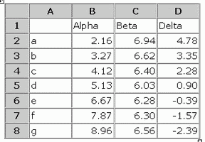
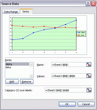
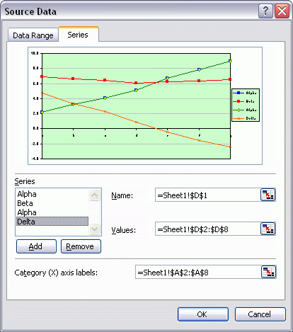
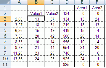
8 in the worksheet for the series values. The image of the chart in the Source Data dialog updates to show the appearance of the chart as these changes are made.

Click nút Add để thêm vào 1 serie mới dùng lại Alpha lần thứ 2, click Name trong hộp Edit và chọn B1 làm tên Serie, Chọn box Values và chọn vùng B2:B8 cho dãy các giá trị.
Click Add lần nữa tạo 1 serie thứ tư cho Delta, Name là D1, Value là D2:D8. Hình minh hoạ trong hộp thoại Source Data sẽ cập nhật cho thấy trước hình dạng của đồ thị theo sự thay đổi các thiết lập. (Dialog 2)

Line09.gif

(Dialog 2) Source Data dialog with two added series


Kết quả là Chart 6:

Line10.gif

Chart 6 Line Chart with Added Series

To be continued
(Còn tiếp)
 
Apply Fill Color Between Lines in a Chart (continue)
Tô màu giữa 2 đường biểu diễn trong 1 biểu đồ. (tiếp theo)
(by Jon Peltier, MVP)

Chart 6 is the chart with four line type series, including two identically positioned Alpha series.
The added series have to be changed to area series. Select the added Alpha series, choose Chart Type from the Chart menu, choose the Area type icon on the left, then the Stacked Area icon on the right (it should already be selected, because it is the default Area chart sub-type), and click OK (see Chart 7). Select the Delta series, and repeat this procedure; if you do it immediately after changing the Alpha series, use the F4 function key shortcut to repeat the last operation (see Chart 8).
Đồ thị 6 cho thấy đồ thị dạng line 4 đường biểu diễn với 2 đường cho dãy số Alpha. Hai đường mới thêm sau sẽ phải đổi thành dạng đồ thị vùng chồng nhau. Chọn serie Alpha thứ 2, chọn Chart type, đổi thành Area trong các chọn lựa bên trái, và chọn Stacked Area trong các chọn lựa bên phải. (Thường là nó đã được chọn sẵn, vì là dạng mặc định cho loại biểu đồ vùng). Nhấn OK, ta được hình đồ thị 7. Chọn serie Delta, làm lại các bước đổi dạng đố thị như trên. Nếu bạn làm ngay sau khi vừa đổi cho serie Alpha xong, nhấn F4. Ta được đồ thi 8.

Line11.gif
Line12.gif


Chart 7 One Series Converted to Area Type -------------------------------------Chart 8 Combination Chart with Two Lines and Two Areas


The chart is nearly finished. Hide the Alpha area series: double click on the series, and on the Patterns tab, select None for Area and for Border, and click OK. Format the Delta area series: double click on the series, and on the Patterns tab, select None for Border, select the fill color you want, and click OK. Hide the legend entries for the Alpha and Delta area series: select the legend, then select the text label part of the unneeded legend entry, and press Delete. Repeat for both unneeded legend entries

Đồ thị đã gần hoàn thành.
Dấu vùng đồ thị của serie Alpha thứ 2: Click đôi vào serie, trong tab Pattern, chọn border là None và Area là none. Sau đó định dạng vùng Delta: chọn Border là none và Area là màu tô theo ý bạn.
Xoá đi cái legend (chú giải đồ thị) của 2 vùng Alpha và Delta: Chọn vùng chú giải, chọn riêng cái chú giải cho vùng Alpha, nhấn Delete. Tương tự cho cái chú giải của Delta.


Line13.gif


Chart 9


Colored Region Between Lines in a Chart


This procedure is flexible and not too complicated, but is subject to the following limitations:
  • It does not work with Smoothed Line option selected, because an area chart has no such option.
  • It does not apply different colors for positive and negative differences, because an area chart series can be filled with only a one color or one continuous fill effect (pattern, gradient, or picture).
    Different colors can be achieved, but it requires more detailed calculations and a more complicated chart.
It does not work directly with an XY chart.


Phần này đã giới thiệu xong cách làm. Quy trình đơn giản và không khó, nhưng có những hạn chế sau:
- Đồ thị không đáp ứng yêu cầu khi bạn chọn Smooth Line Option, vì đồ thị dạng vùng không có lựa chọn này.
- Không có chọn lựa nào để tô màu riêng các giá trị dương và âm của Delta, vì 1 serie chỉ có thể dùng 1 màu để hiển thị hoặc chỉ 1 cách tạo hiệu ứng màu ( pattern, gradient, or picture).
Màu âm dương khác nhau có thể làm được, nhưng đòi hỏi phải tính toán chi tiết hơn, và đồ thị có dạng phức tạp hơn.
Hết.
 
XY Area Chart: Fill Below an XY Series.

XY Area Chart: Fill Below an XY Series.
Tô màu bên dưới đường biểu diễn trong 1 biểu đồ dạng XY.
(by Jon Peltier, MVP)


Did you ever want to fill the area under an XY chart series? You tried an Area chart, but that didn't work; the X axis didn't scale properly, and you couldn't get the lines and markers you wanted. You can fill the area under an XY series by using a combination XY - Area chart, plus a little creative treatment of the X values of the Area series and of the scaling of the secondary X axis.
I used the following sample data in A1:D11. A3:A10 holds my XY Series X data, B3:B10 holds my XY Series Y data, B2 holds my XY Series name. C2:C11 holds my Area Series X data, D2:D11 holds my Area Series Y data, D1 holds my Area Series name.

Có khi nào bạn muốn tô màu biểu đồ dạng XY chưa? Bạn thử với biểu đồ dạng Area, nhưng nó không tốt. Trục hoành không được chia tỷ lệ đúng, và bạn không tạo được đường biểu diễn và những nút đánh dấu như ý. Bạn có thể tô màu phần dưới của đồ thị XY bằng cách kết hợp 2 dạng đồ thị XY và Area, cộng với việc tính toán giá trị trên trục hoành và với cách nhân tỷ lệ của 1 trục hoành thứ 2.
Ta hãy dùng dữ liệu mẫu dứơi đây trong vùng A1:D11. A3:A10 là dữ liệu cho biểu đồ XY trên trục X, B3:B10 là dữ liệu cho biểu đồ XY trên trục Y, B2 là tên của dữ liệu Y của biểu đồ XY.
C2:C11 là dữ liệu trục X của biểu đồ Area, D2:D11 là dữ liệu Y của biểu đồ Area, D1 là tên dữ liệu Y này.

DataSource.gif

Data Source

The data in A:B is the "regular" data; that in C:D is derived with formulas. D3:D10 simply point back to B3:B10, while D2 and D11 are zero. The formula in C3 is:
=INT(1000*A3/15 + 1.5)or more generally:
=INT(1000*(A3-Xmin)/(Xmax-Xmin) + 1.5)where Xmin and Xmax are the min and max of the X axis for the data (0 and 15 for this sample data). This formula rescales the X axis range to run from 1 to 1001 for the area chart; I could have used ROUND in place of INT and the extra .5 in the formula, but I thought of this approach first. The formula in C3 is dragged down to fill C3:C10. C2 has the formula =C3, and C11 has the formula =C10, so the first and last values are repeated, to line up with the zeros added in D2 and D11.
Select A2:B10 and make an XY chart.

Dữ liệu 2 cột A:B là dữ liệu thông thường. Dữ liệu ở 2 cột C:D là dữ liệu tính được bằng công thức. C3:C10 đơn giản là lấy lại dữ liệu ở B3:B10. D2 và D11 bằng không. Công thức ô C3 là:
=INT(1000*A3/15 + 1.5)hoặc mở rộng ra là:
=INT(1000*(A3-Xmin)/(Xmax-Xmin) + 1.5)với Xmin và Xmax là giá trị lớn nhất và nhỏ nhất của trục hoành, ở đây là 0 và 15. Công thức này tính lại tỷ lệ chia trục X từ 1 đến 1001 cho đồ thị dạng Area. Tôi đã từng dùng Round thay cho Int và cộng với 0,5 thay cho 1,5, nhưng tôi nghĩ đến công thức này trước hết. Ô C3 sẽ được sao chép công thức xuống đến C10. Công thức ô C2 là =C3 và công thức C11 là =C10, như vậy giá trị đầu cuối được lập lại, tương ứng với các giá trị 0 ở D2 và D11.Chọn vùng A2:B10 và tạo biểu đồ XY như sau:

ChartXY01.gif

Chart 01​

Add the Area data as a new series. Select and copy C1:D11, select the chart, and Paste (Ctrl-V is the easiest way here, or use Paste Special from the Edit menu to add the data as new series). The two series in our chart do not line up at all, but we'll fix that in a minute.

Thêm vào biểu đồ chuỗi giá trị (serie) mới. Chọn và copy C1:D11, sau đó chọn cái biể đồ và paste vào là nhanh nhất, còn không thì chọn Paste Special trong menu Edit, chọn tiếp Add as new Series. Hai đường biểu diễn này chẳng ngay hàng chút nào, nhưng ta sẽ sửa lại trong vài giây.

ChartXY02.gif

Chart 02​

(Còn tiếp)​
 
Lần chỉnh sửa cuối:
XY Area Chart: Fill Below an XY Series.
Tô màu bên dưới đường biểu diễn trong 1 biểu đồ dạng XY.
(by Jon Peltier, MVP)
Tiếp theo

Before you panic about the scaling, right click on the new series, choose Chart Type from the popup menu, and pick an area chart style.

Trước khi hốt hoảng về cái trục hoành, nhấn chuột phải lên cái serie mới, nhấn Chart Type để chọn lại dạng biểu đồ thành Area.


ChartXY03.gif


Chart 03​


Double click on the area series, and on the Axes tab, select Secondary. At this point, on the Patterns tab I also changed the fill color of the Area series, and set the border to None.

Nhấn đôi vào serie area, trong hộp thoại Format Data Serie, tab Axes, chọn secondary. Cũng trong bước này, trong tab Pattern, đổi màu fill cho area và chọn border là None.


ChartXY04.gif


Chart 04​


Right click on the chart, choose Chart Options, and on the Axes tab, check the Secondary Category X Axis, and select the Time Scale option. Excel automatically puts the new category axis at the top of the chart, so everything above the XY series is filled. Or it would be if we had lined it up yet.

Nhấn chuột phải vào biểu đồ, chọn Chart Option, trong tab Axes, đánh dấu chọn Secondary Category X Axis, và chọn Time Scale. Excel sẽ tạo trục hoành riêng cho serie này ở trên đỉnh của biểu đồ và tô màu phía trên của Area. Hoặc nó có thể tô nếu ta đã chọn trục hoành riêng từ trước.


ChartXY05.gif


Chart 05​


Double click the secondary horizontal axis (top of the chart), and on the Scale tab, set the minimum to 1 and the maximum to 1001 (replace the dates), and set Base Unit = Days. On the Patterns tab, choose None for Major and Minor Tick Marks and Tick Mark Labels. The area series now fits the XY series perfectly, above the XY series.

Click đôi cái trục hoành thứ 2 phía trên, trong tab Scale, sửa minimum thành 1 và Maximum thành 1001 thay cho ngày tháng, và sửa Base unit thành days. Trong tab Pattern, chọn None cho Major tick mark, None cho Minor tick mark và None cho tick mark label. Đồ thị vùng của serie Area và đồ thị XY của serie Value đã trùng vào nhau hoàn hảo.


ChartXY06.gif


Chart 06​


Double click on the secondary Y axis (right side of the chart), and UNcheck the Category (X) Axis Crosses at Maximum Value box.

Click đôi vào trục tung thứ 2 bên phải, bỏ chọn trong ô chọn Category (X) Axis Crosses at Maximum Value.


ChartXY07.gif


Chart 07​


Finally, right click on the chart, select Chart Options, and on the Axes tab, UNcheck the Secondary Y Axis box.

Cuối cùng, click chuột phải vào đồ thị, chọn Chart option, và trong tab Axes, click bỏ chọn ô Secondary Y Axis.


ChartXY08.gif


Chart 08​
Hoàn tất tô màu bên dưới đồ thị dạng XY. Sẽ dịch tiếp tô màu giữa 2 đường biểu diễn XY.
 

File đính kèm

  • FillXYChart.xls
    22.5 KB · Đọc: 92
Lần chỉnh sửa cuối:
XY Area Chart: Fill Between XY Series.

XY Area Chart: Fill Between XY Series.
Tô màu giữa đường biểu diễn trong 1 biểu đồ dạng XY.
(by Jon Peltier, MVP)

Did you ever want to fill the area between two XY Chart series? You tried Stacked Area charts, but that didn't work; the X axis didn't scale properly, and you couldn't get the lines and markers you wanted. You can fill the area between XY series by using a combination XY - Stacked Area chart, plus a little creative treatment of the X values of the Area series and of the scaling of the secondary X axis.
Note: This is an extension of the XY Area Chart: Fill Below an XY Series technique found elsewhere on this web site.

Có khi nào bạn muốn tô màu giữa 2 đường biểu diễn của 1 đồ thị dạng XY? Bạn đã thử với dạng đồ thị dạng Area nhưng không được; trục hoành không theo đúng tỷ lệ và bạn không có những điểm đánh dấu như ý. Bạn có thể tô màu giữa 2 đường biểu diễn đồ thị dạng XY, bằng cách kết hợp 2 dạng đồ thị XY và Area chồng giá trị, với cột phụ tính toán lại cho giá trị của trục X riêng cho đồ thị dạng Area (chồng giá trị).
Ghi chú: Đây là bài tiếp theo cho bài XY Area Chart: Fill Below an XY Series tô màu bên dưới đồ thị dạng XY.


I used the following sample data in A1:F11. A3:A10 holds my XY Series X data, B3:C10 holds my two XY Series Y data, B2 and C2 hold my XY Series names. D2:D11 holds my Area Series X data, E2:F11 holds my Area Series Y data, E1 and F1 hold my Area Series names.

Ta hãy dùng dữ liệu mẫu dứơi đây trong vùng A1:F11. A3:A10 là dữ liệu cho biểu đồ XY trên trục X, B3:C10 là dữ liệu cho 2 serie của biểu đồ XY trên trục Y, B2:C2 là tên của dữ liệu Y của biểu đồ XY.
D2:D11 là dữ liệu trục X của biểu đồ Area, E2:F11 là 2 cột dữ liệu Y của biểu đồ 2 Area chồng nhau, E1:F1 là tên dữ liệu Y này.

DataSource2.gif


Data source​


The data in A:C is the "regular" data; that in D:E is derived with formulas. E3:E10 simply point back to B3:B10, while E2 and E11 are zero. F3:F10 show the differences between the values in column B and C, while F2 and F11 are zero. The formula in D3 is:
=INT(1000*A3/15 + 1.5)or more generally:
=INT(1000*(A3-Xmin)/(Xmax-Xmin) + 1.5)where Xmin and Xmax are the min and max of the X axis for the data (0 and 15 for this sample data). This formula rescales the X axis range to run from 1 to 1001 for the area chart; I could have used ROUND in place of INT and the extra .5 in the formula, but I thought of this approach first. The formula in D3 is dragged down to fill D3:D10. D2 has the formula =D3, and D11 has the formula =D10, so the first and last values are repeated, to line up with the zeros added in E2:F2 and E11:F11.
Select A2:C10 and make an XY chart.

Dữ liệu 3 cột A:C là dữ liệu thông thường. Dữ liệu ở 2 cột D:E là dữ liệu tính được bằng công thức. E3:E10 đơn giản là lấy lại dữ liệu ở B3:B10. E2 và E11 bằng không.
Dữ liệu F3:F10 là hiệu số của 2 cột B và C, F2 và F11 bằng không.
Công thức ô D3 là:
=INT(1000*A3/15 + 1.5)hoặc mở rộng ra là:

=INT(1000*(A3-Xmin)/(Xmax-Xmin) + 1.5)với Xmin và Xmax là giá trị lớn nhất và nhỏ nhất của trục hoành, ở đây là 0 và 15. Công thức này tính lại tỷ lệ chia trục X từ 1 đến 1001 cho đồ thị dạng Area. Tôi đã từng dùng Round thay cho Int và cộng với 0,5 thay cho 1,5, nhưng tôi nghĩ đến công thức này trước hết. Ô D3 sẽ được sao chép công thức xuống đến D10. Công thức ô D2 là =D3 và công thức D11 là =D10, như vậy giá trị đầu cuối được lập lại, tương ứng với các giá trị 0 ở E2, F2 và E11, F11.Chọn vùng A2:B10 và tạo biểu đồ XY như sau:
FillBetween01.gif


Chart 01​


Add the Area data as a new series. Select and copy D1:F11, select the chart, and Paste (Ctrl-V is the easiest way here, or use Paste Special from the Edit menu to add the data as new series). The two pairs of series in our chart do not line up at all, but we'll fix that in a minute.

Thêm vào biểu đồ chuỗi giá trị (serie) mới. Chọn và copy D1:F11, sau đó chọn cái biểu đồ và paste vào là nhanh nhất, còn không thì chọn Paste Special trong menu Edit, chọn tiếp Add as new Series. Hai cặp đường biểu diễn này chẳng ngay hàng chút nào, nhưng ta sẽ sửa lại trong vài giây.


FillBetween02.gif


Chart 02​


Before you panic about the scaling, right click on the new Area1 series, choose Chart Type from the popup menu, and pick a stacked area chart style.
Thay vì hốt hoảng, bạn hãy nhấn chuột phải vào serie Area1, sửa lại dạng biểu đồ là Stacked Area trong mục chọn Chart Type.


FillBetween03.gif


Chart 03​


Now it really looks like we've broken our chart, but like most conditions, this is only temporary. Select the Area2 series, and repeat the Chart menu - Chart Type steps (or press the F4 function key to repeat the previous action).
Bây giờ coi đồ thị giống như ta đã phá hư đồ thị, nhưng chỉ là tạm thời. Chọn tiếp đường biểu diễn Serie2 và làm như bước trên, chuyển thành dạng Stacked Area, hoặc nhấn F4 nếu vừa thực hiện xong bước trên.


FillBetween04.gif


Chart 04

Còn tiếp​
 
Lần chỉnh sửa cuối:
XY Area Chart: Fill Between XY Series.
Tô màu giữa đường biểu diễn trong 1 biểu đồ dạng XY.
(by Jon Peltier, MVP)
Tiếp theo

Double click on the Area1 series, and on the Axes tab, select Secondary. At this point, on the Patterns tab I also changed the fill color of the Area series, and set the border to None.
Nhấn đôi vào serie area1, trong hộp thoại Format Data Serie, tab Axes, chọn secondary. Cũng trong bước này, trong tab Pattern, đổi màu fill cho area và chọn border là None.


FillBetween05.gif


Chart 05​


Like before, select the Area2 series, and repeat the Double Click - Secondary Axis steps (or press the F4 function key to repeat the previous action).
Giống như trên, chọn Secondary Axis cho vùng đồ thị Area2, hoặc nhấn F4 để lập lại bước trên.


FillBetween06.gif


Chart 06​


Note that I've given the Area 2 series is ultimate fill color, and while Area1 will eventually be transparent, I'm keeping it pale yellow so we can watch it. I've also removed the border around both area series.
Right click on the chart, choose Chart Options, and on the Axes tab, check the Secondary Category X Axis, and select the Time Scale option. Excel automatically puts the new category axis at the top of the chart, so everything above the XY series are filled. Or it would be if we had lined it up yet.
Lưu ý rằng cuối cùng tôi sẽ tô màu Area2 trong khi Area1 sẽ không tô màu, nhưng tôi giữ màu vàng để bạn có thể theo dõi. Tôi cũng sẽ xoá bỏ các đường bao (border) chung quanh các Area series.
Nhấn chuột phải vào biểu đồ, chọn Chart Option, trong tab Axes, đánh dấu chọn Secondary Category X Axis, và chọn Time Scale. Excel sẽ tạo trục hoành riêng cho 2 serie này ở trên đỉnh của biểu đồ và tô màu phía trên của Area. Hoặc nó có thể tô nếu ta đã chọn trục hoành riêng từ trước.


FillBetween07.gif


Chart 07​


Double click the secondary horizontal axis (top of the chart), and on the Scale tab, set the minimum to 1 and the maximum to 1001 (replace the dates), and set Base Unit = Days. On the Patterns tab, choose None for Major and Minor Tick Marks and Tick Mark Labels. The area series now fits the XY series perfectly, above the XY series.

Click đôi cái trục hoành thứ 2 phía trên, trong tab Scale, sửa minimum thành 1 và Maximum thành 1001 thay cho ngày tháng, và sửa Base unit thành days. Trong tab Pattern, chọn None cho Major tick mark, None cho Minor tick mark và None cho tick mark label. Đồ thị vùng của 2 serie Area1, area2 và đồ thị XY của 2 serie Value1, Value2 đã trùng vào nhau hoàn hảo.


FillBetween08.gif


Chart 08​


Double click on the secondary Y axis (right side of the chart), and UNcheck the Category (X) Axis Crosses at Maximum Value box.

Click đôi vào trục tung thứ 2 bên phải, bỏ chọn trong ô chọn Category (X) Axis Crosses at Maximum Value.


FillBetween09.gif


Chart 09​


Now right click on the chart, select Chart Options, and on the Axes tab, UNcheck the Secondary Y Axis box.
Bây giờ, click chuột phải vào đồ thị, chọn Chart option, và trong tab Axes, click bỏ chọn ô Secondary Y Axis.


FillBetween10.gif


Chart 10​


Finally, double click on the Area1 series, and on the Patterns tab, choose None for the fill color to make it transparent. Select the extraneous legend entry (click once on the legend, then once on the text label for Area1), and press Delete to hide the entry. Don't select the space containing the clear rectangle, or you'll delete the series and have to start again (or use the CTRL+Z Undo shortcut).
Cuối cùng nhấn đôi chuột vào serie Area1, trong tab Pattern, chọn Fill bằng None để làm cho nó trong suốt. Chọn những chú giải đồ thị (legend) dư (click 1 lần để chọn vùng chú giải, click lần thứ 2 để chọn riêng từng chú giải) và nhấn Delete để xoá đi. Đừng click vào khoảng trống chỗ có hình chữ nhật tô màu (hoặc không tô của Area1), nếu không bạn sẽ xoá cả serie trên đồ thị và phải làm lại từ đầu, hoặc phải nhấn Ctrl Z để thực hiện lại.


FillBetween11.gif


Chart 11​
 
Floating Column Charts. Biểu đồ cột dạng treo

Floating Column Charts.
Biểu đồ cột dạng treo
Some kinds of data look very nice and are easily understood in the form of a "floating" column or bar, in which the column floats in the chart, spanning a region from a minimum value to a maximum value.
The secret of a floating column chart is to make a stacked column chart with two series, the first representing the lower extent of the floating column, the second representing the difference between the upper and lower ends of the column. By formatting the lower series to be invisible, the upper series floats in your chart.
Excel comes with a built-in custom chart type called "Floating Bars," shown below. It produces a horizontally-aligned bar chart with two series, minimum and range, the way we will do. But numerical data often is best displayed vertically, and there is no "Floating Columns" corollary. Further, the Floating Bars chart is a chart with features only a salesman could love, like 3-D effects and a disturbing background gradient fill.
Một số loại dữ liệu xem rất đẹp và dễ hiểu trong 1 đồ thị loại cột hoặc thanh ngang “bay”, ở đó các cột và thanh ngang dường như lơ lửng trong biểu đồ, hiển thị từ nhỏ nhất đến lớn nhất.
Bí mật của dạng biểu đồ cột “bay” là làm biểu đồ dạng 2 cột chồng nhau, với 2 serie dữ liệu: serie thứ nhất thể hiện phần đế cột, serie thứ hai thể hiện chênh lệch giữa các giá trị các đỉnh cột. Bằng cách định dạng đế cột sao cho không nhìn thấy, phần thân trên cột sẽ lơ lửng trong biểu đồ.
Excel cung cấp 1 dạng biểu đồ gọi là Thanh ngang lơ lửng như hình sau. Nó thể hiện 1 biểu đồ thanh ngang với 2 series dữ liệu, nhỏ nhất và hiệu số, như chúng ta sẽ làm. Nhưng dữ liệu dạng số thường được thể hiện tốt theo chiều dọc, và lại không có dạng đồ thị cột “treo”. Hơn nữa đồ thị thanh ngang bay chỉ có các anh bán hàng là ưa, với hiệu ứng 3 chiều và nền tô màu nửa đậm nửa lợt.

Barchart01.gif

Building a Floating Column Chart
Fortunately, in Excel you can make just about any kind of chart that you want, if you are willing to do a little work. In my example, I am going to plot average monthly temperatures. The average monthly high and low temperatures came from the statistic, and I used simple worksheet formulas to compute the average monthly ranges. Our two series are the average minimum temperatures and the average ranges.
Dựng 1 biểu đồ hình cột “treo”
May thay, trong Excel bạn gần như có thể tạo bất kỳ dạng biểu đồ nào bạn muốn, nếu bạn sẵn lòng làm 1 số thao tác. Trong thí dụ dưới đây, ta sẽ thể hiện nhiệt độ trung bình các tháng trong năm. Nhiệt độ cao nhất và thấp nhất ta có thể lấy trong các bảng thống kê, và ta dùng công thức đơn giản của Excel để tính con số chênh lệch nhiệt độ giữa thấp nhất và cao nhất. Hai series dữ liệu dùng cho biểu đồ sẽ là serie nhiệt độ thấp nhất và serie nhiệt độ chênh lệch.

Barchart02.gif

The first step in creating a floating column chart is to create a stacked column chart. Select the first three rows of data in the table, run the Chart Wizard, and make a stacked column chart.
Bước thứ nhất là tạo 1 biểu đồ dạng 2 cột chồng nhau. Tô chọn vùng gổm 3 dòng trên của bảng dữ liệu, chạy Chart Wizard, và tạo.

Barchart03.gif

Now double click on the "Average Low" series (shown here in red), to open the Format Series dialog. Click on the Patterns tab, and select None for Border and Area. This series becomes invisible, but still supports the columns that denote the temperature range.
Giờ thì click đôi vào serie chênh lệch nhiệt độ (màu đỏ), để mở hộp thoại Format Series. Trong tab Pattern, chọn None cho cả Border và Area. Phần biểu đồ này sẽ không còn nhìn thấy, nhưng vẫn còn đó làm nhiệm vụ cái đế cột.

Barchart04.gif
 
Floating Column Charts. (continue)
Biểu đồ cột dạng treo (tiếp theo)
The process is the same for a floating bar chart. First create a stacked bar chart, then make the first series invisible so the second series floats in place.
Quy trình cũng tương tự như thế để tạo 1 biểu đồ thanh ngang chồng dữ liệu (nối thanh ngang). Sau dó làm cho serie thứ nhất vô hình, và serie thứ 2 tựa như đang trôi lơ lửng theo dòng nước.

Barchart05.gif

Knowing the basic mechanics of floating column and bar charts allows you to create a wide range of charts.
Biết cơ sở về phương pháp vẽ biểu đồ “bay”, bạn sẽ làm được nhiều kiểu biểu đồ khác như sau:

Sử dụng thí dụ khác cho dễ hình dung: Với dữ liệu là chi phí, doanh thu và lãi gộp, ta có thể dùng dạng biểu đồ thanh ngang biểu diễn lãi gộp theo từng tháng như sau:

Barchart06.gif

Dùng serie Chi phí và serie lãi gộp để thiết lập đồ thị.

Barchart07.gif

Đây là trường hợp khá lý tưởng của doanh thu và chi phí: Kinh doanh phát triển đều và chi phí được kiểm soát tốt theo dạng định phí + biến phí: Định phí không đổi theo thời gian, biến phí tỷ lệ thuận với doanh thu. Trong trường hợp này là:
Chi phí = 4+ Doanh thu x 65%.

Sự thật thường bẽ bàng, nếu kiểm soát chi phí không tốt và không có chiến lược kinh doanh để doanh thu trồi sụt thì biểu đồ sẽ xấu :

Barchart08.gif

Barchart09.gif
 
Web KT
Back
Top Bottom